
Here are the latest fruits of my effors... in photography :-D


En español 
You don't need to be a physicist specialised in optics to take a good photo, but it is necessaary to understand some basic concepts about light: what it is and how it behaves, the relationship between frequency and colour and how to understand light to make the most of it.
I won't go into all the technical details about these concepts, as there are loads of extensive academical texts you can refer to. I will, however, mention specially a book which is used as basic academic material in photography. It is called "Basic photography", by Michael Langford, now available in its ninth edition in [Amazon] at a more than reasonable price for the knowledge it will give you. I strongly encourage its read to anyone who is considering taking up photography half seriously.
[Light] is a wave that behaves as a particle (photon) or viceversa... the long standing scientific argument is still raging, according to some. I won't take sides. The fact of the matter is it has direction, orientation, frequency and intensity.
...All of those who have ever stood next to a flash when it fires off can even tell you it has mass, but, as I say, I won't go into debates about this point X-D.


En español
I've just re-read the previous post and, although it is quite dense (I tend to squeezze too much detail), the proper terms are used in the right manner in the right places, so with a little practice and some [Saint Google], you can make pretty good use of it.
I've also realised that, wihout some very important sources, I wouldn't know much of what I do about photography. So, credit is given where credit is due. The majority of what have learned (or rather, the better part of the most important parts) come from [Maestro Ayarza] and also one of his pieces of advice: the [Super Foto Digital] magazine (Grupo V). And no, I don't get any money for this :-P
Right. Having said this, let's get started...
Last time we saw the first of the panels in the Camera Raw, the Basic panel. The next panel is the Tone Curve panel. This panel allows us to control (to a certain extent an always on an image that has been callibrated in the Basic panel) highlights, Lights, Darks and Shadows in our picture, that is, it allows us to enhance the details in over or under exposed areas. This is done over the whole picture so watching the preview panel is a must. Overdoing it on the controls will leave us with a grayed picture. Practice, once again, will lead us to the best results. The next panel, Detail, will allow us to alter the focus of a picture. My advice is that the focus be done when taking the picture. Another way to apply this focusing is through the focus filter, which we will talk about in further articles. Much more interesting, in this panel, is the noise reduction tool. This is very useful when we have taken pictures in less than optimal conditions or exposure times were too long. We will talk about noise in further articles (I really am giving myself a lot of homework here!!). As advised in the panel, it is best to view the image at full zoom, 100% or even a little more.
 Right. This next panel is where I spend a lot of my time. Here, for each colour channel, we can tweak and correct colours to out heart's content. Again, it effects over the whole picture which means we can, for example, make the sky's blue that much deeper (by balancing blue and cyan - we can even get green and purple skies- saturating and darkening the channels), make praeries have a more intense green or make a dusk's reds much more striking.
 The next panel, Split Tone, will allow us to control the colour tones splitting them into light and dark areas separately. I have used this panel sparsely, and when I have I didn't get what I expected. So any advice will be welcome and if and when I learn something new, I will edit this... (sorry...)
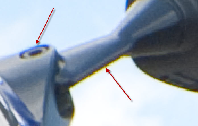
 The Lens correction panel will allow us to correct chromatic aberrations and vignetting that our cheap (or not so much) lenses may cause in our photos. Vignetting occurs because the lens' barrel "shadows" the image sensor, so the corners are darkened. This last effect can be corrected or introduced in this panel if, for example, we wanted to simulate an antique photo in black and white (B/W) or sepia. Chromatic aberrationbs can happen either due to incorrect exposure or minor defects in our lenses. We will need to zoom in to 400% in order to get a clear view of these aberrations. These may be examples of what we may find and the third picture would be the corrected image:


 The next two panels, Camera calibration and Settings, are designed to save us time. The first will allow us to select an automatic colour callibration and balancing based on the setting we choose (I usually leave this one alone). The second panel will allow us to save settings we have applied to a single image so we may apply the same settings to a series of images taken under the same conditions, saving us a lot of time since we don't have to go through all the options again.


En español
I begin, today, a series of articles in which I will share all I know and I keep learning about photography. It doesn't warrant the title of "tutorial" but I'm hoping some will find it useful.
We will begin with the first step in post-processing a photo, its digital developing. Yes, digital photos also get developed!
To begin with, we should always shoot in [RAW] format. Why? Here are some of the many reasons:
- RAW format contains all the raw information gathered by the camera's sensor (not compressed nor processed)
- Images are made up of 3 channels: RGB (Red Green Blue) and, for each channel, the JPEG format (8 bits) contains 256 levels of information, that is, it can contain 16,7 million colours (that's the maximum amount of colour combinations of all three channels). The RAW format contains 65,000 levels for each channel which means over 280 TRILLION colour combinations. This implies...
- Improved final quality
- Greater flexibility: with all that information (much of which isn't perceptible to the human eye) will multiply the possibilities of what we can achieve with a photo.
- MUCH larger dynamic range
What all this really implies will be seen over the next articles (HDR from a single shot, separate channel processing, high lights recovery and an extremely long etc which is largely impossible to do with JPEG.
Of course,m all this flexibility comes at a cost: memory. The RAW images are pure raw unprocessed data, all the sensor can capture. This implies that, a single photo of a 10.2MP (mega-pixel) camera such as my EOS450D will take up around 10Mb. For me, the advantages far outweigh the price :-)
There are several tools for the digital developing of RAW images (see the wikipedia link above). I will be using Adobe's Camera RAW 5.7, included in their Creative Suite 4 (which I'm lucky enough to own through my work). And, as an example, I will use [this photo] which you can download, for practicing purpouses, from [here].
Once opened, the following screen will show:
This screen is divided into several panels: Preview panel, Histogram (very important!), Tool panel and the button section. The Preview will show the effects of our actions on the Tools panel. The Tools panels (9 in total) are where we will be modifying the images parameters. The button section will enable us to save, open the image, etc. We'll begin with the Histogram, which represents graphically. From left to right we have the brightness values (black on the left, white on the right) which are represented in lines. The highter the line, the more information for that value. Each colour chanel has its own graphic. Overlaps are shown in white or the corresponding colour combination.
On the top corners we can see the control which, when pressed, will show the burnt areas (right button, shows burnt in red in the Preview) or absolute black (left button, showing blue in Preview). Both red and blue show areas with no detail information or "flat" (totally black or totally white)areas.
This panel will also show information on how the photo was shot: the f value (7.1), shutter speed (1/125s), sensor sensitivity (ISO), the lens used (18-55) and the focal distance (18mm). All these I will talk about in other articles.
 The first tool panel is the Basic panel, maybe the most important one. From here we will control Temperature, Exposure and (general) Saturation. As a rule of thumb we will start with "day" light values, that is 5500 and 0 tint. From this we will balance to taste, depending on what we wish to transmit and the conditions in which the shot was taken, (bluer and colder to the left and redder and warmer to the right).
 If we want to see the results on the actual image we will release the ALT key. When doing this in Blacks, the preview will show white for non-black information and towards black as the information is lost towards black. Again, as a rule of thumb we will aim to remove all burnt areas and level blacks so only general shapes are shown in light yellow. How much burnt or black we allow depends on taste and our goal. Other controls include Fill light (to lighten gently), Brightness (we will generally avoid going over the 100 value) and Contrast.
 En español
