
I've just re-read the previous post and, although it is quite dense (I tend to squeezze too much detail), the proper terms are used in the right manner in the right places, so with a little practice and some [Saint Google], you can make pretty good use of it.
I've also realised that, wihout some very important sources, I wouldn't know much of what I do about photography. So, credit is given where credit is due. The majority of what have learned (or rather, the better part of the most important parts) come from [Maestro Ayarza] and also one of his pieces of advice: the [Super Foto Digital] magazine (Grupo V). And no, I don't get any money for this :-P
Right. Having said this, let's get started...
Last time we saw the first of the panels in the Camera Raw, the Basic panel. The next panel is the Tone Curve panel. This panel allows us to control (to a certain extent an always on an image that has been callibrated in the Basic panel) highlights, Lights, Darks and Shadows in our picture, that is, it allows us to enhance the details in over or under exposed areas. This is done over the whole picture so watching the preview panel is a must. Overdoing it on the controls will leave us with a grayed picture. Practice, once again, will lead us to the best results. The next panel, Detail, will allow us to alter the focus of a picture. My advice is that the focus be done when taking the picture. Another way to apply this focusing is through the focus filter, which we will talk about in further articles. Much more interesting, in this panel, is the noise reduction tool. This is very useful when we have taken pictures in less than optimal conditions or exposure times were too long. We will talk about noise in further articles (I really am giving myself a lot of homework here!!). As advised in the panel, it is best to view the image at full zoom, 100% or even a little more.
 Right. This next panel is where I spend a lot of my time. Here, for each colour channel, we can tweak and correct colours to out heart's content. Again, it effects over the whole picture which means we can, for example, make the sky's blue that much deeper (by balancing blue and cyan - we can even get green and purple skies- saturating and darkening the channels), make praeries have a more intense green or make a dusk's reds much more striking.
 The next panel, Split Tone, will allow us to control the colour tones splitting them into light and dark areas separately. I have used this panel sparsely, and when I have I didn't get what I expected. So any advice will be welcome and if and when I learn something new, I will edit this... (sorry...)
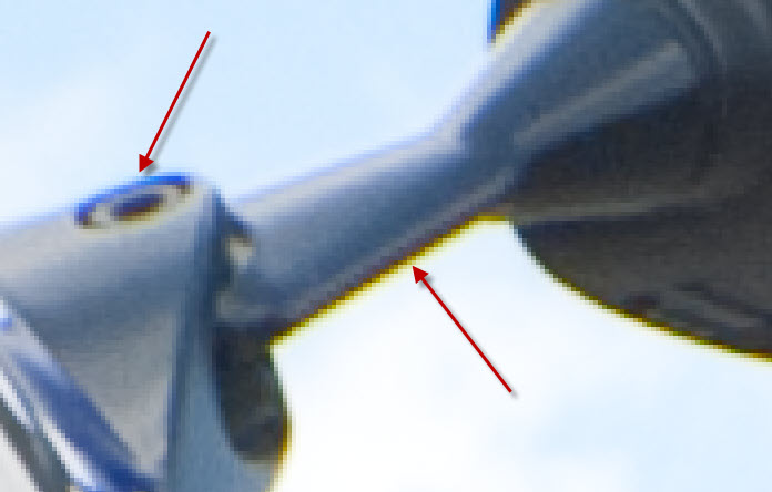
 The Lens correction panel will allow us to correct chromatic aberrations and vignetting that our cheap (or not so much) lenses may cause in our photos. Vignetting occurs because the lens' barrel "shadows" the image sensor, so the corners are darkened. This last effect can be corrected or introduced in this panel if, for example, we wanted to simulate an antique photo in black and white (B/W) or sepia. Chromatic aberrationbs can happen either due to incorrect exposure or minor defects in our lenses. We will need to zoom in to 400% in order to get a clear view of these aberrations. These may be examples of what we may find and the third picture would be the corrected image:


And this is an example of what you may accomplish by introducing some vigneting (obviously exagerated). It is usually used to supress these subtle shadows.


 The next two panels, Camera calibration and Settings, are designed to save us time. The first will allow us to select an automatic colour callibration and balancing based on the setting we choose (I usually leave this one alone). The second panel will allow us to save settings we have applied to a single image so we may apply the same settings to a series of images taken under the same conditions, saving us a lot of time since we don't have to go through all the options again.
Right. Now we have applied all the adjustments we needed to the photo, we have a few options at our disposal. We may:
- Save the settings for the photo and leave it for a later time by pressing "Done".
- Cancel all the work we've put into it or, by pressing Alt (the button will change to Reset), discard all the changes and start again.
- Open the image in Photoshop. We have several options. We may open the image as an intelligent object (which will allow us to come back and modify any settings made in Camera Raw at any time) or not. If you look carefully, under the preview panel you may notice a link which will open a window with options of what to do when we Open the image. These are:
1.- Colour space: Adobe RGB
2.- Colour depth: 16 Bits
3.- Size: (by default, the camera's. In my case) 3888x2592 pixels
4.- Resolution: 240 DPI
5.- Shapness adjustment (for paper, card, etc.) and how much - None
6.- Open as Inteligent Object (yes or no): Yes


I've given you the options I use, taking into account I use an EOS 450D, which has 10,2Megapixels (MPs) and takes photos with 16bit depth (remember the previous post which included an explanation on colour depth). Resolution is determined by how we want to use the image and it means "How many Dots Per Inch (DPI) will I need for a good image". For screen displays the standard is 72DPI, whist printed photos (in photographic paper) use above 200DPI. If we take, for example a 3888x2592pixel image, at 240DPI it will be 41.15x27.43cm big. At 72DPI, the same image would measure 131.16x91.44cm. The resolution, then, determines the density our image will have.
You may have notice I've skipped a tools panel at the top of the window. This is justified since, other than the zoom (first button on the left) and the rotation controls (the last two buttons), all other actions are best done in Photoshop itself (again, this is just my opinion).

Other interesting links:
- Ayuda de Adobe para [Camera RAW]
(to be continued...)
En español 
